Words of Wisdom:
"Cheese poofs remind me of a bird and a clean window....the glare confuses the bird and it hits the window really hard! "
- Ytiema
Visual Identity
- Date Submitted: 02/26/2011 05:04 PM
- Flesch-Kincaid Score: 65.7
- Words: 482
- Essay Grade: no grades
- Report this Essay
Visual Identity
Ellen Walden
CGD 218
Prof. Morgan Johnson
February 13, 2011
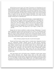
I recognize the logo as the symbol for Apple Incorporated. When I think about Apple
and the logos above I think of Macintosh computers, and iPhones and iTunes. When I
started researching this symbol, I read that it was designed by art designer Rob Janoff in 1977.
(The Apple Museum, 2010, “Apple Facts”)
I have seen the colored logo in different commercials or at stores selling Apple computers during the 80’s and early 90’s. I have seen the current logo of all grays on my iTunes website and on now the iPad and the iPhone. It still stays very recognizable with the apple shape with the bite taken out of it. The only change of the logo was from a multicolored to monochromatic.
I feel that the logo symbolizes neutrality and change in the company. When Jean Louis Gassée was asked about his thoughts of the color Apple logo he answered: "One of the deep mysteries to me is our logo, the symbol of lust and knowledge, bitten into, all crossed with the colors of the rainbow in the wrong order. You couldn't dream of a more appropriate logo: lust, knowledge, hope, and anarchy." (The Apple Museum, 2010, “Apple Facts”). I believe that Stephen Jobs was going to let the Apple products sell on their own merit and not use the colored logo as way to sell his products. He wanted to get away from the colored logo and change with the times as computers were starting to come into every household.
The basic design elements and graphic techniques used for this logo are the shape of an apple, the color gray and lighting. In the text, Berger says that the color gray is neutral or achromatic. (A. Berger, 2008, Ch 3, pg 90). With the 2 different shades of gray, I believe that it could have a shadow and in the text, lighting shapes our perceptions of things. The top part could resemble flat lighting which corresponds to rationality and knowledge and the darker...
Ellen Walden
CGD 218
Prof. Morgan Johnson
February 13, 2011
I recognize the logo as the symbol for Apple Incorporated. When I think about Apple
and the logos above I think of Macintosh computers, and iPhones and iTunes. When I
started researching this symbol, I read that it was designed by art designer Rob Janoff in 1977.
(The Apple Museum, 2010, “Apple Facts”)
I have seen the colored logo in different commercials or at stores selling Apple computers during the 80’s and early 90’s. I have seen the current logo of all grays on my iTunes website and on now the iPad and the iPhone. It still stays very recognizable with the apple shape with the bite taken out of it. The only change of the logo was from a multicolored to monochromatic.
I feel that the logo symbolizes neutrality and change in the company. When Jean Louis Gassée was asked about his thoughts of the color Apple logo he answered: "One of the deep mysteries to me is our logo, the symbol of lust and knowledge, bitten into, all crossed with the colors of the rainbow in the wrong order. You couldn't dream of a more appropriate logo: lust, knowledge, hope, and anarchy." (The Apple Museum, 2010, “Apple Facts”). I believe that Stephen Jobs was going to let the Apple products sell on their own merit and not use the colored logo as way to sell his products. He wanted to get away from the colored logo and change with the times as computers were starting to come into every household.
The basic design elements and graphic techniques used for this logo are the shape of an apple, the color gray and lighting. In the text, Berger says that the color gray is neutral or achromatic. (A. Berger, 2008, Ch 3, pg 90). With the 2 different shades of gray, I believe that it could have a shadow and in the text, lighting shapes our perceptions of things. The top part could resemble flat lighting which corresponds to rationality and knowledge and the darker...
Comments
Express your owns thoughts and ideas on this essay by writing a grade and/or critique.
Sign Up or Login to your account to leave your opinion on this Essay.
Copyright © 2024. EssayDepot.com
No comments